


SRC gets its own logo |11 June 2012
It is with this in mind that the SRC has deemed it important to have its own logo that illustrates what it does and also what it is striving to achieve and maintain in its day to day activity.
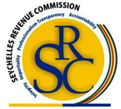
The logo (as can be seen in the illustration) is a good representation of what SRC stands for.
The circle (which is yellow in colour) represents the colour of value which one can associate with gold, meaning that as per SRC’s terms of reference that is collecting revenue, is viewed as valuable to the Seychelles economy. The SRC abbreviation is embossed in the yellow circle again to reflect its main priority.
Outside the circle, there are five nouns; integrity, impartiality, professionalism, transparency and accountability. They represent the five core values that SRC aims to reinforce in its daily operations so as to promote fairness and equity, and also mitigate and/or eradicate corruption.
Furthermore, SRC aims to be fair in the delivering of its services by providing a service that is not biased towards certain clients, but one that delivers promptly, efficiently and effectively. By incorporating these core values in the logo, it will be a constant reminder to all stakeholders and staff of what SRC wants to uphold.
Also incorporated in the logo, are the colours of the Seychelles Flag so as to denote the patriotic aspect of what SRC does in contributing to the Seychelles economy.
The logo therefore encompasses all the aspects of what SRC does internally and externally towards achieving a successful outcome in terms of revenue collection.
The new SRC logo was launched on June 1, 2012.
Contributed